Text design is an area that can often be overlooked. But it’s worth paying attention, because it can have a significant impact. Just like in print, the right design can make your online text easy to read – and beautiful to look at, too. It’s a powerful and simple way to enhance visual appeal, increase trust and retention – and, of course, showcase your writing!
Let’s take a look at just some of the benefits of great text design for your business.
Making long-form text more accessible
Attention span is a real challenge. The longer your text and the more information it contains, the easier it is for the reader to lose focus. In fact, research has shown that the majority of people don’t read word-by-word when reading online. Instead, they tend to skim the text for keywords, and their focus is usually concentrated on the top part of the document.
If you have a lot of detailed information to present, then it’s even more important to make the text easy to read. With a few strategic moves, you can help direct your reader’s attention to the crucial information you want them to absorb.
Maximise the top of the page
Your introduction is going to draw your reader’s eye, so make the most of it. This is an area where content and design truly come together.
In content terms, the very first paragraph needs to contain meaningful information and strong keywords. Forget fluffy introductions and vague statements – hook your reader with the big promise that will keep them reading on.
Your designer can increase this impact by making the text at the top of the page stand out using colours, visuals, and larger fonts. That’s a truly persuasive start.
Facilitate skimming
Once you’ve got your reader’s attention, you know they’re likely to skim the rest of the text. So don’t fight it! Make it easy for them to find the information they need, and you’ll keep them engaged to the end.
A simple way to do this is to break up your content into smaller chunks with clear headings. This helps your reader to skip over anything that isn’t immediately interesting and get straight to the point.
This technique is most effective when the text is designed to match. Visible stand-out headings and eye-catching graphics make it even easier to direct the reader’s focus. The right layout can also break the flow of the text, making the different sections easier to identify.
Highlight your CTA
The call to action (CTA) is another aspect where text and design need to work in tandem. Once your reader has all the information, they need to know what to do next. Set up a consultation, book a demo, buy a service? The next step should be loud and clear.
Compare these CTAs:
If you want to know more about the topic of this article, feel free to get in touch.
Any questions? Click here to book your no-strings discovery call. We’ll discuss your needs and provide a free, personalised quote.
A vague CTA, like the first example, makes it much less likely that your reader will get in touch. The second example provides clear directions and promises a concrete outcome, funnelling your visitor to the next stage of the process.
Once you’ve got that compelling call to action, your designer can make it stand out from the information around it – whether that’s with big, bold text, vivid colours, or a custom-designed button.
Make your campaign (even) more persuasive

When it comes to marketing campaigns, the link between text and design is even more striking.
Are the words Just Do It inspiring on their own? How about the Nike swoosh, with nothing extra? It’s the symbiosis of text and visuals that makes one of the world’s most famous slogans truly memorable.
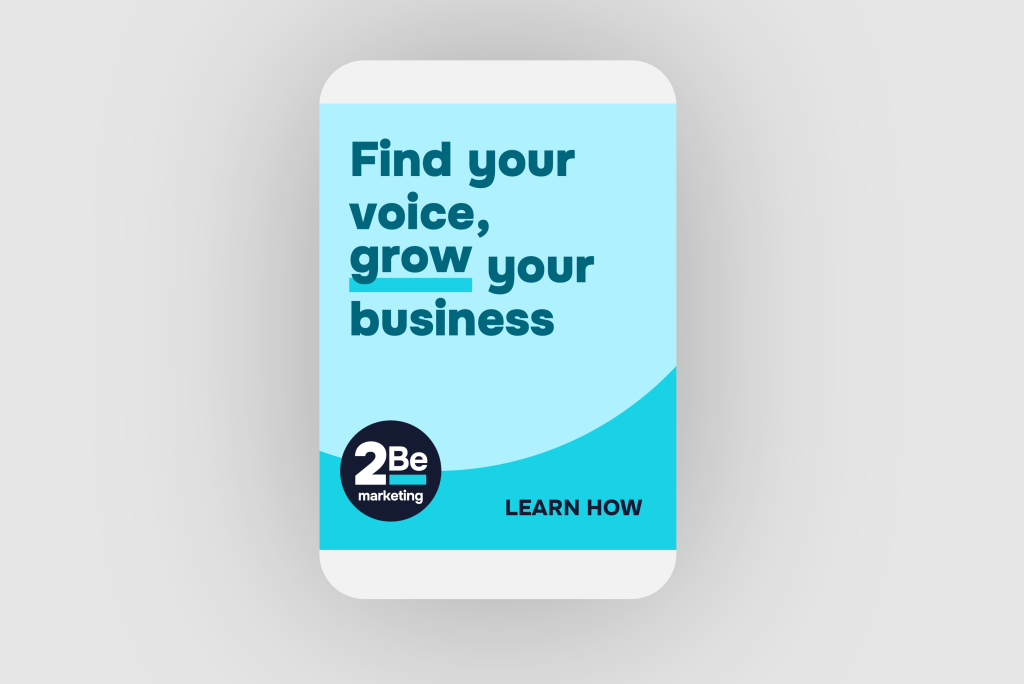
That symbiosis really does have to work. A client of mine has a logo showing a word raised up on a bar. That’s a great visual identifier for the company, and it’s one I wanted to showcase in his marketing assets.
But for the chemistry to come together, it has to be the right text. ‘Grow’, ‘Highlight’, ‘Raise’: words like this combine brilliantly with the elevated visual. In contrast, a term like ‘Explore’ – with its suggestion of a meandering path ahead – would appear random and even confusing. Luckily, my client’s company is in the marketing sector, so there’s no shortage of evocative words.
Break down complex information
As we’ve already seen, online visitors are unlikely to work through a wall of dense, linear text. This can be a challenge when you need to present a lot of information at once.

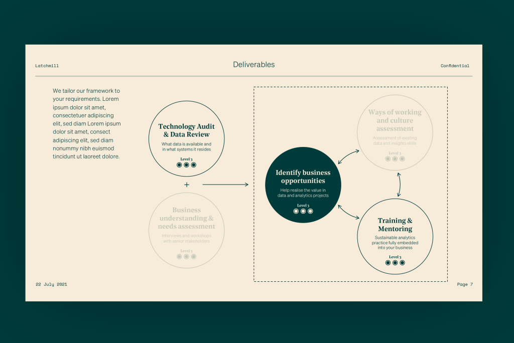
Fortunately, designers have a powerful tool at their disposal. The right infographic is a great way to make data easier to digest, and difficult topics more persuasive. With plenty of different options, it’s crucial that text and design work in synergy for a truly effective graphic display.
Let’s take a common example. You might need your potential clients to understand how your company works with each customer. Rather than outline the entire process step by step in writing, your designer can make a visually appealing infographic, such as a flowchart. This allows you to highlight the key steps of the process, dropping filler text such as ‘at this stage’, ‘and then’, and ‘in this case’.
Here, the text should be set out in clear, simple phrases of a roughly similar length. This will help the designer make the infographic clean and symmetrical. It’s also important to have the same type of text in the same location, so the reader instantly knows what the chart represents with no need for a written explanation.
Content and design: a powerful pairing
Writing and design are two very different skillsets, so it’s no wonder that they’re often handled by different experts. But when the two come into synergy, they enhance each other for a far greater impact. By having your writers and designer work together, you can be more effective in engaging your target audience and achieving your strategic communication goals.
For web designers looking to make their work even more impactful, aligning text and design is key to creating exceptional user experiences. I’m thrilled to be part of WordHound’s Overnight Agency Toolbox, where I share insights on how designers can integrate our expertise to elevate their clients’ projects.


